
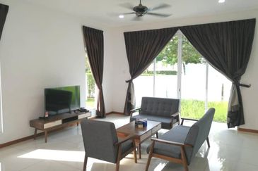
THE instinct to beautify and decorate our living spaces is a basic one that has been passed down to us from prehistoric times. Primordial caveman, for example, decorated their walls with graphic depictions mostly of animals. The oldest known Paleolithic cave paintings date back around 40,000 years and are the clearest testament to the longevity of this aspect of human behaviour. Whilst caves have given way to houses and cave art has made way for wall treatments, we are essentially just picking up from where our ancestors left off.
As a visual society, colour plays an enormous influence in stimulating our emotional and sensory receptors before subliminally influencing our feelings and moods. There is no denying the prevalence and impact of colour in our daily lives. Since one’s taste in colour is subjective and often guided by our experiences and cultural persuasions, it is no surprise that paint manufacturing companies today are constantly developing new hues to suit different palettes.
Recognising how colours play a huge part in Asia both in its natural environment and culture, Nippon Paint Malaysia saw the need to create a unique colour palette for Asia alone. The effects of colours and how behaviour is influenced by colour, fashion, retail performance, lifestyle trends and culture in Asia today were analysed to come up with the colour palettes for Asia.
“As the pioneer of innovating colour palettes, we drive the colour trend through our annual Asia Pacific Chromazone Colour Forecasting Workshop.
“The workshop brings together over 50 designers and colour professionals from across Asia to curate a colour palette devised by Asian consultants specifically for the Asian market,” states Yaw Seng Heng, group managing director of Nippon Paint Malaysia.
“The final results of the colour forecasting workshop are then compiled into our Trend Beyond Colours publication which has developed into an important reference point for interior designers, furniture manufacturers, colour enthusiasts and even automotive manufacturers,” Yaw elaborates.
In 2016 alone, Trend Beyond Colours 2016/2017 has distributed more than 100,000 copies across Asia, he adds.
Characterising the best of Asia’s diverse landscapes, rich cultures and unique pulsating vibe, Nippon Paint Malaysia’s hot colour picks for 2016/2017 aims to transform commonplace living spaces into sanctuaries for creative expression. Comprising nine (9) key hues, the colour  palettes have been categorised into three themes – ‘We Are One’, ‘New Eco’ and ‘Wonder-Lust’.
The first series, “We Are One”, features modern colours reminding how new age technology and social media are affecting our lives. The second series, “New Eco”, celebrates the wonders of Mother Earth while the third collection, “Wonder-Lust” embodies today’s “YOLO” or “You only live once” culture as one seeks new interests, hobbies, experiences and adventures.
WONDER-LUST
") Blue Lullaby
Blue Lullaby
[NP PB 1550P] – In Perfect Balance
Maintain a balanced lifestyle to nourish a harmonious living by establishing a sense of peace and stillness within the sanctuary of your home by way of this cool shade.
")
Being Peach [NP YO 1219T] – Explore, Indulge And Let Us Live
Scratch away at illusions to discover the true self within. Expressing spontaneity, this exotic colour radiates positivity, innocence and youthfulness and will infuse a bright and happy tone into common areas.
") Fast Car [NP AC 2076A] – Because I’m Happy
Fast Car [NP AC 2076A] – Because I’m Happy
Bursting with a robust personality, this vivid colour celebrates the joys of living. Demonstrating passion, desire, confidence and determination, this flamboyant hue will add depth and dramatic visual interest to any surface.
WE ARE ONE
") Founder Blue [NP PB 1527D] – Cultivating The Social Element
Founder Blue [NP PB 1527D] – Cultivating The Social Element
This hue is usually associated with depth and stability, symbolising trust and loyalty. Inspired by connectivity through social media, this colour invites interaction whilst projecting conviction and self-expression.
") Gray Knight [NP N 2001T] – Making A Raw Connection
Gray Knight [NP N 2001T] – Making A Raw Connection
Mysterious and versatile, this shade of grey is a subtle companion that marries itself beautifully to a variety of colours, from bright and vibrant hues to soft and mellow pastels, giving rise to an infinite number of possibilities.
") Green Tuft [NP BGG 1666A] – Reflect, Revive & Renew
Green Tuft [NP BGG 1666A] – Reflect, Revive & Renew
Representing growth, optimism and hope, this powerful shade serves to revive and uplift one’s mood and spirits, whilst injecting vitality and freshness into a given zone.
NEW ECO
") Tavern Buff [NP N 1867P] – Nostalgically Vintage
Tavern Buff [NP N 1867P] – Nostalgically Vintage
This colour is a play on an old favourite. Modernise the glorious past by employing a contemporary neutral which doubles as an accent colour when combined with other softer shades. Warm and wholesome, this colour introduces a delicate serenity into living spaces.
") Volcanic Black [NP N 1918A] – Embrace the 4R Philosophy
Volcanic Black [NP N 1918A] – Embrace the 4R Philosophy
This elegant colour is inspired by the sustainable philosophy of the 4Rs – Reduce, Reuse, Recycle and Regenerate, and, draws on a tonal palette that marries traditional and modern elements to create a statement of sophisticated and understated luxury.
")
Lush [NP BGG 1605T] – The Narrative Of Vibrant Serenity
Representing purity and tranquility, this chic hue promotes a soothing and calm environment and acts as the ideal canvas for bold and vibrant accents.
This story first appeared in TheEdgeProperty.com pullout on Sept 30, 2016, which comes with The Edge Financial Daily every Friday. Download TheEdgeProperty.com pullout here for free.
TOP PICKS BY EDGEPROP
Seri Mutiara Apartments, Bandar Baru Seri Alam
Masai, Johor
Jalan NIP @ Nusajaya Industrial Park
Gelang Patah, Johor
Taman Nusa Bestari, Skudai
Iskandar Puteri, Johor
SKS Habitat Apartment, Larkin
Johor Bahru, Johor


